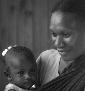
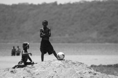
I don’t want to construct a case against lush, detailed photography. I quite enjoy some of it. But these days I can’t seem to bring myself to do it. Frankly, I don’t think I want to learn so much about photography that I’m ever capable of the visual backflips and pyrotechnics that characterise much of the move from film to digital.
Perversely, it’s precisely because I can do more that I choose to do less.
 In case you haven’t noticed, I’ve been on a bit of a black and white kick lately on my photo site. Part of the reason is that the house I’m living in right now is owned by a talented photographer who has a treasure trove of photography-related books in his office downstairs.
For the last month or so, I’ve been plundering it, reading mostly (auto)biographical books by and about some of the great war photographers of the last century. The purity of expression that black and white gives, the way it focuses on the subject, is something I find really fascinating. I especially like dark compositions, where the play of light and shadow is smooth across a high dynamic range.
I’m particularly partial to monochrome composition; I always have been. Back when I was working as a lighting designer and director in the theatre, I was taken to task more than once for dropping the light levels below what people were used to, and for not taking advantage of a full palette.
I know my counselors meant well. But to hell with them.
I love shape, silhouette and the play of light and shadow. I love it especially on the screen. Print is touchier and vastly more difficult in technical terms. At least, that’s my experience. I suspect this derives from the fact that the transition between additive colour mixing (i.e. lighting pixels on a screen) and subtractive colour mixing (printing ink on paper) is not intuitive and runs counter to where physics wants to take you. In short, you need to play tricks on the eye to get what you want. You want to make the page appear luminous, whereas the screen already is.
With black and white digital photography, you send only a tiny fraction of available visual information to the screen. In practice, it’s a simple matter of turning on all the pixels (i.e. starting with a white palette) and then removing information until the shadows tell you what you want them to. I love that process, both as metaphor and craft.
Now, all photography is trickery. Beautiful trickery, when it works. But when I look at a lot of recent photography, what I see is a layering of cleverness and craft so thick that one can no longer see the canvas.
I’ve always preferred minimalist design, a few sharp strokes that go straight to the essential. Rather than trying to fit everything in, I want to get everything else out.

I don’t want to construct a case against lush, detailed photography. I quite enjoy some of it. But these days I can’t seem to bring myself to do it. Frankly, I don’t think I want to learn so much about photography that I’m ever capable of the visual backflips and pyrotechnics that characterise much of the move from film to digital.
Perversely, it’s precisely because I can do more that I choose to do less.
